 DRAWSVG
user's manual
DRAWSVG
user's manual
DRAWSVG
user's manual
DRAWSVG
user's manual
The color chooser svg panel is launched from it's icon
 in the menu and is
displayed above.
in the menu and is
displayed above.
It can be also displayed from other tools such as marker definition.
See showcase using color chooser
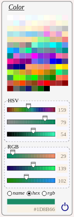
Table 7.5. Color chooser svg panel
|
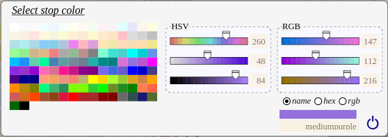
The color can be selected from the extended palette or defined by its HSV/RGB components. Each HSV/RGB component can be defined with the slider or entered within the text field. The color value has 3 available formats :
To select the value, click on the renderer rectangle. The value can be defined with it's text field. To cancel the action, click on the close icon. The color chooser can be displayed with a horizontal alignment.
|
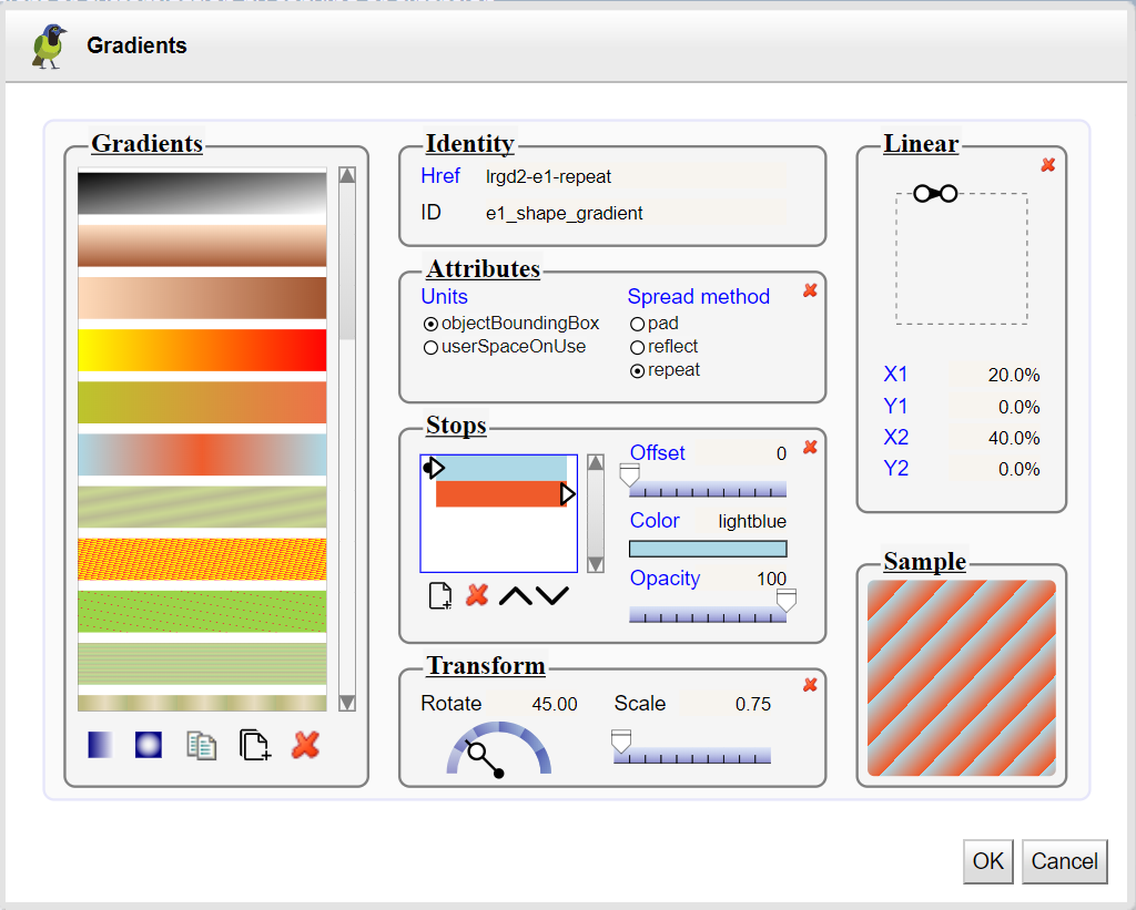
The gradient dialog panel is launched from it's icon
 in the menu and
is displayed in grab mode.
in the menu and
is displayed in grab mode.
Gradients consist of continuously smooth color transitions along a vector from one color to another, possibly followed by additional transitions along the same vector to other colors.
There are two types of gradients : linear and radial .
See creating , using gradients showcases for interactive demonstrations.
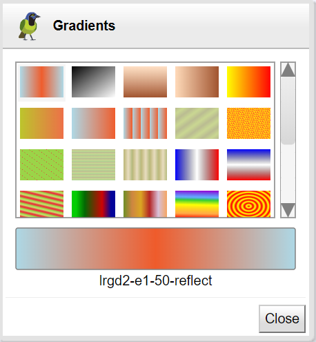
The panel allows to edit a gradient definition, add a new one radial or linear, copy an existing, or extends another to customize it.
Select a gradient in the list, then change properties :
Units, if you select userSpaceOnUse then the drawing of control points will be not available because these must be expressed as drawing coordinates and not as a percentage.
Spread mode with the toggle group,
Linear or Radial definition with the control points,
Add stop elements, remove or change order,
Move stop offsets with the sliders,
Choose stop color and change its opacity with the slider.
Apply a transformation to the gradient
The sample box show the gradient with the current scale of the drawing.
All changes are applied with the apply button and the current gradient is applied to the style property (stroke or fill) of the selected object.
To directly apply a gradient, use the selection tool
 .
.
The selected gradient is drawn with the current scale of the drawing.
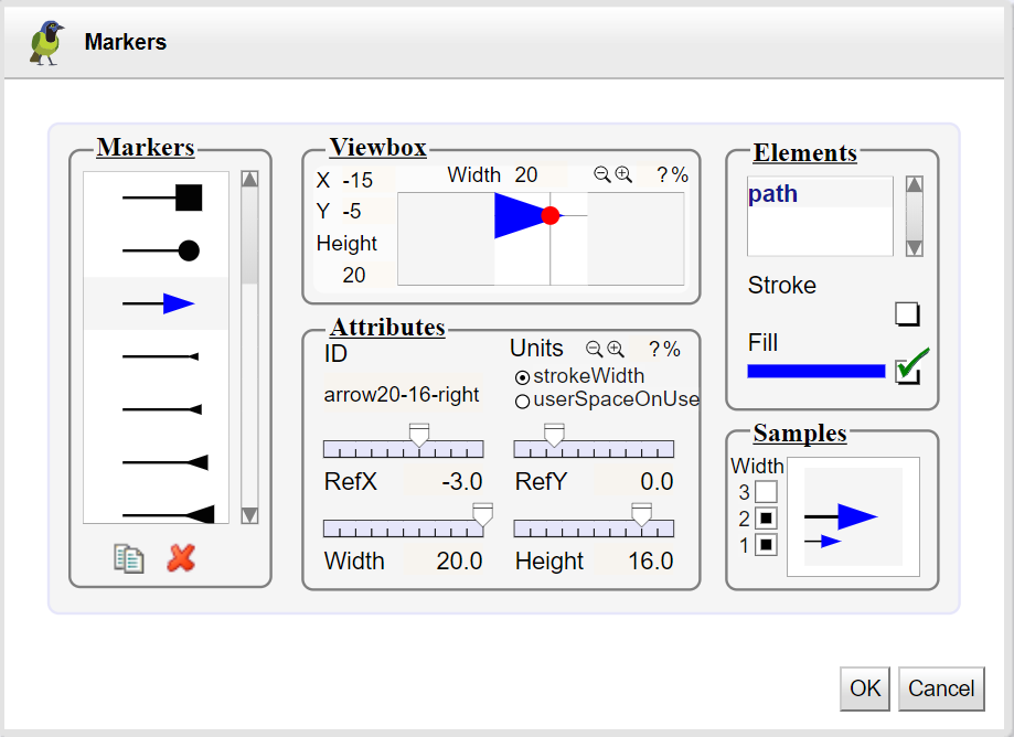
The ‘ marker ’ element defines the graphics that is to be used for drawing arrowheads or polymarkers on a given ‘path’, ‘line’, ‘polyline’ or ‘polygon’ element.
The marker dialog panel is launched from it's icon
 in the menu and
is displayed in grab mode.
in the menu and
is displayed in grab mode.
See creating , using markers showcases for interactive demonstrations.
The panel allows to edit/copy/delete a marker definition,
To add a new one, drawn it, select elements and use the action marker definition from the selection menu.
Select a marker in the list, then change attributes :
ViewBox : Use text fields ( x , y , width , height ), icons (zoom/in zoom/out) and text field ratio for extending or reducing the area. To add a margin of 20% type 120<enter> in the ratio field.
Id : the marker's id.
Units : Defines the coordinate system for the size (width,height) and the contents of the ‘marker’. If markerUnits equals " strokeWidth ", the size and the contents of the ‘marker’ represent values in a coordinate system which has a single unit equal the size in user units of the current stroke width in place for the graphic object referencing the marker. If markerUnits=" userSpaceOnUse ", the size and the contents of the ‘marker’ represent values in the current user coordinate system in place for the graphic object referencing the marker. The default units is strokeWidth'.
Size : Define the dimensions of the marker relative to specified units. Use text fields ( width , height ), icons (zoom/in zoom/out) and text field ratio for extending or reducing the size of the tile.
Ref point : change the coordinates of the reference point, move it's red circle or use refX / refY sliders and fields.
Elements : List of all the graphic elements of the marker with their stroke and fill colors.
To change the colors (stroke or fill) of an element of the marker, select it in the list and click on the renderer rectangle of the color to change it with the color chooser or remove it with the check-box. .
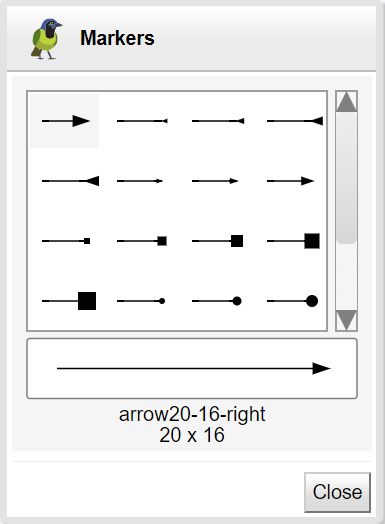
Finally the samples box show the renderer of the selected marker with different stroke widths.
All changes are applied with the apply button and the current marker is applied to the style property (marker-start, marker-mid, marker-end) of the selected object.
To directly apply a marker, use the selection tool
.
The selected marker is drawn with the current scale of the drawing and style property (marker-start, marker-mid, marker-end).
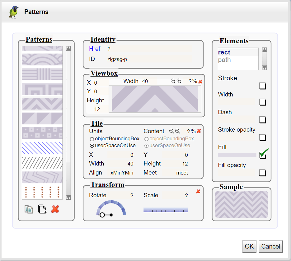
The ‘ pattern ’ element defines the graphic that is to be used to fill a shape by replicating an object.
It performs two key functions: hatching and wallpaper.
These function uses two different units ( userSpaceOnUse , objectBoundingBox ).
A pattern is defined either in the coordinate system of the drawing (userSpaceOnUse) or in proportion to the bounding box of the object to fill (objectBoundingBox).
A pattern may be defined by extension of another. The most frequent case is the definition of a pattern by applying a transformation to another basic pattern.
The pattern dialog panel is launched from it's icon
in the fill
menu and is displayed in grab mode.
See creating , using patterns showcases for interactive demonstrations.
The panel allows to edit/copy/extends/delete a pattern definition,
To add a new one, drawn it's elements, select them and use the action pattern definition from the selection menu.
Select a pattern in the list, then change attributes :
Identity : the inherited pattern's id (href) and the pattern's id. The Inherited properties are drawn in blue color.
ViewBox : Use text fields (x,y,width, height), icons (zoom/in zoom/out) and text field ratio for extending or reducing the area. To add a margin of 20% type 120<enter> in the ratio field.
Tile : Define the dimensions and units of the filling tile. Use text fields (x,y,width, height), icons (zoom/in zoom/out) and text field ratio for extending or reducing the size of the tile.
Transform : Rotating and scaling the tile.
Elements : List of all the graphic elements of the pattern with their style editable properties (stroke, stroke-width, stroke-opacity, stroke-dash, fill, fill-opacity).
To change the colors of an element inside a pattern, click on the element inside the viewBox or select it from the list and click on the render rectangle of the color to change it with the color chooser or remove it with the check-box.
Defining a pattern by transformation of another. Select the basic pattern and click on the extension icon. Set it's id and apply the desired transformation.
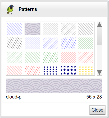
Finally the Sample box show the renderer of the selected pattern with the scale of the drawing.
All changes are applied with the apply button and the current pattern is applied to the style property (stroke or fill) of the selected object.
To directly apply a gradient, use the selection tool
.
The selected pattern is drawn with the current scale of the drawing.
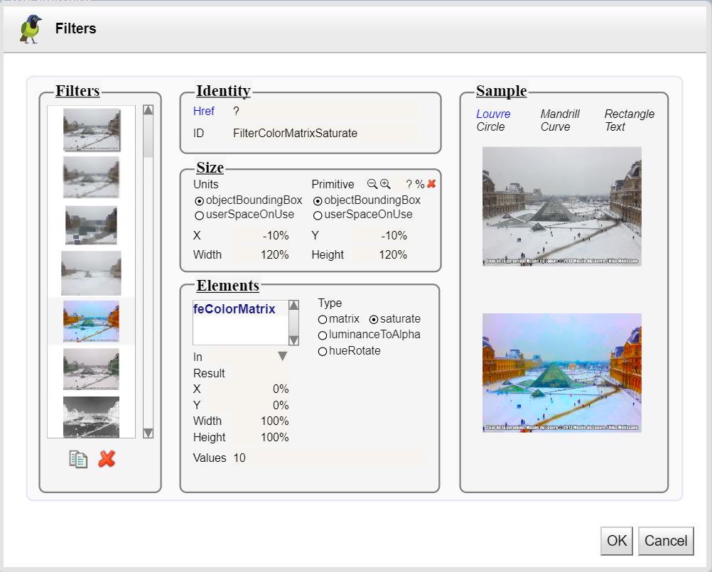
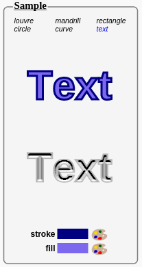
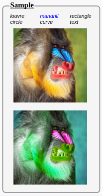
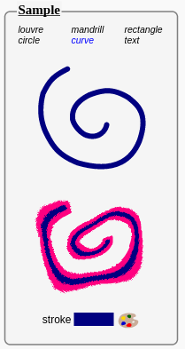
A ‘ filter ’ consists of a series of graphics operations that are applied to a given source graphic to produce a modified graphical result.
See showcase using filters
The panel allows to edit/copy/delete a filter definition,
Select a filter in the list, then change attributes :
Size : Use text fields ( x , y , width , height ), icons (zoom/in zoom/out) and text field ratio for extending or reducing the area. To add a margin of 20% type 120<enter> in the ratio field.
Id : the filter's id.
Units : Defines the coordinate system for the size (width,height) and the contents of the ‘filter’.
Elements : List of all operations of the filter.
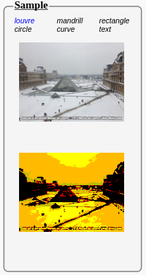
Sample : The rendering of the filter applied to 6 different graphical objects (picture of the pyramid of the Louvre, Mandrill monkey, rectangle, circle, curve, text). .
All changes are applied with the apply button and the current filter is applied to the fillter property of the selected object.
